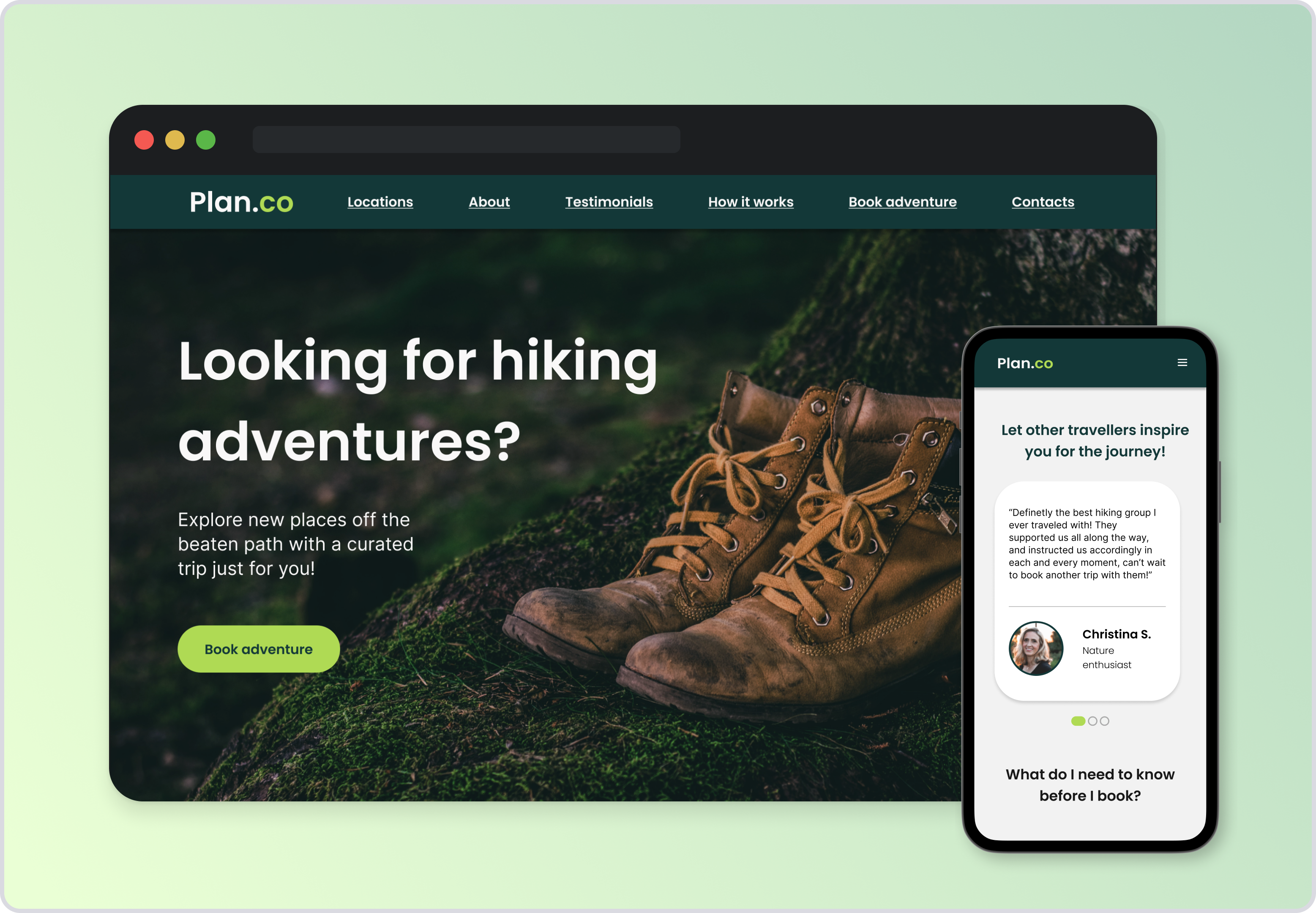
Workshop Proposal
This project was part of a mini workshop from Flux Academy, in which we were asked to create a website that encouraged users to fill in a survey for exploring new locations. Through the course I decided to focus on learning more about the components and auto-layout features on Figma.
The Process
1- Mood board and branding
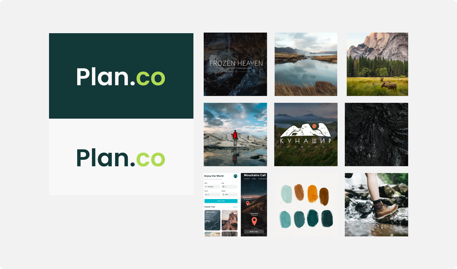
After reading the creative brief, the first step was to create an inspiration mood board and a very simple Logo for the website.
Because the theme for the website is related to exploring off the beaten path locations, I wanted my mood board to include pictures from nature and hiking that evoque the feeling of wilderness and adventurous paths, as well as some inspiration for color palettes.
2- Colors and Typography
For the colors I chose a dark green and a more vibrant green as the accent color for the website, as I wanted it to feel fresh and connected to nature themes. I tested the colors contrast by using the A11y color checker plugin on Figma.

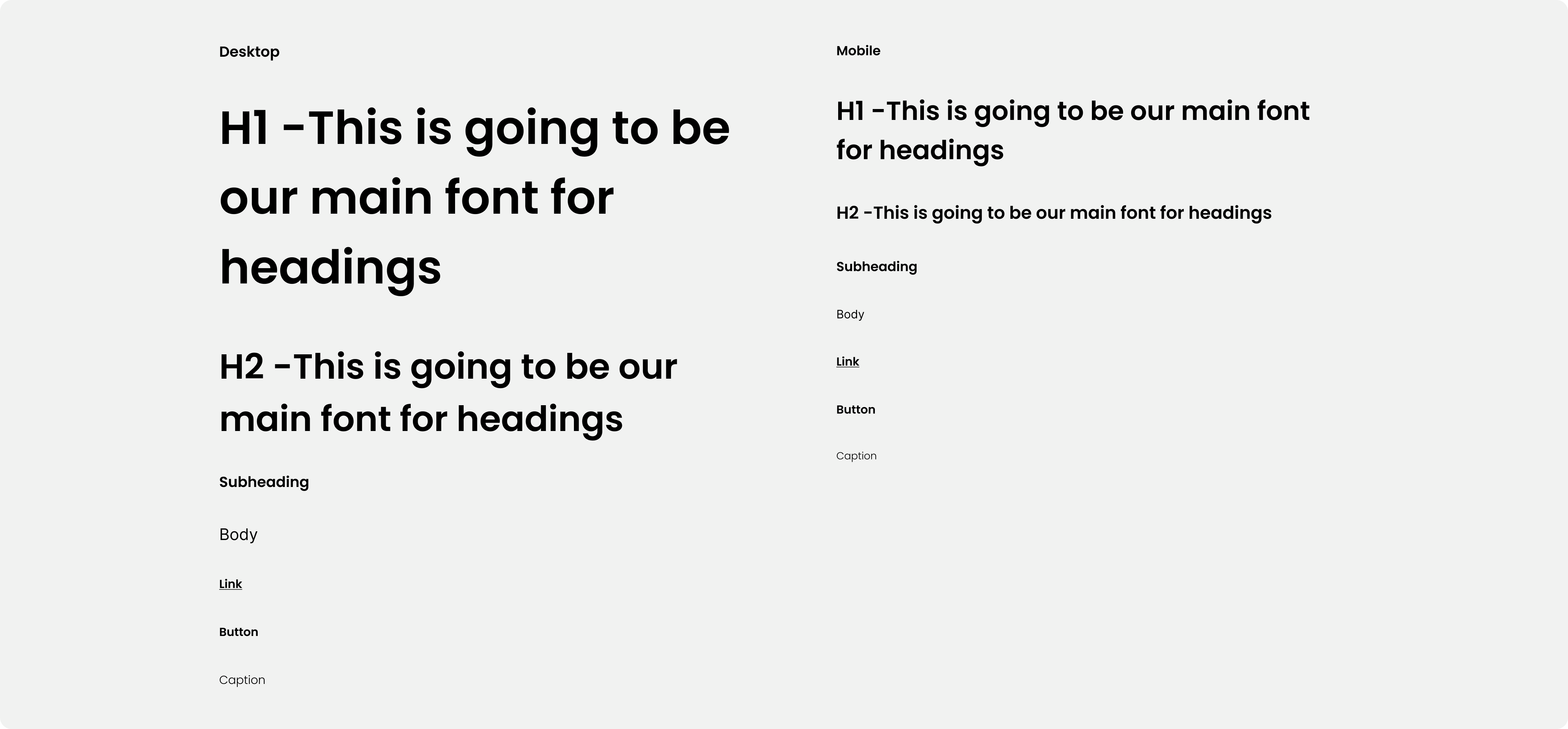
For the typography I chose two different font families. Poppins, which is modern and friendly-looking, and for the body text I chose plain and simple Inter, modern and easy to read. The typography was tweaked for the mobile size too.
3- Creating the wireframes
The wireframes were based on a sequence we learned through the course which consisted in the user learning about the product, creating trust and finally deciding to fill in the survey.
The website structure goes as follows:
- On the first section we have the Hero section that informs what kind of product the company is advertising, followed by a section with a product showcase.
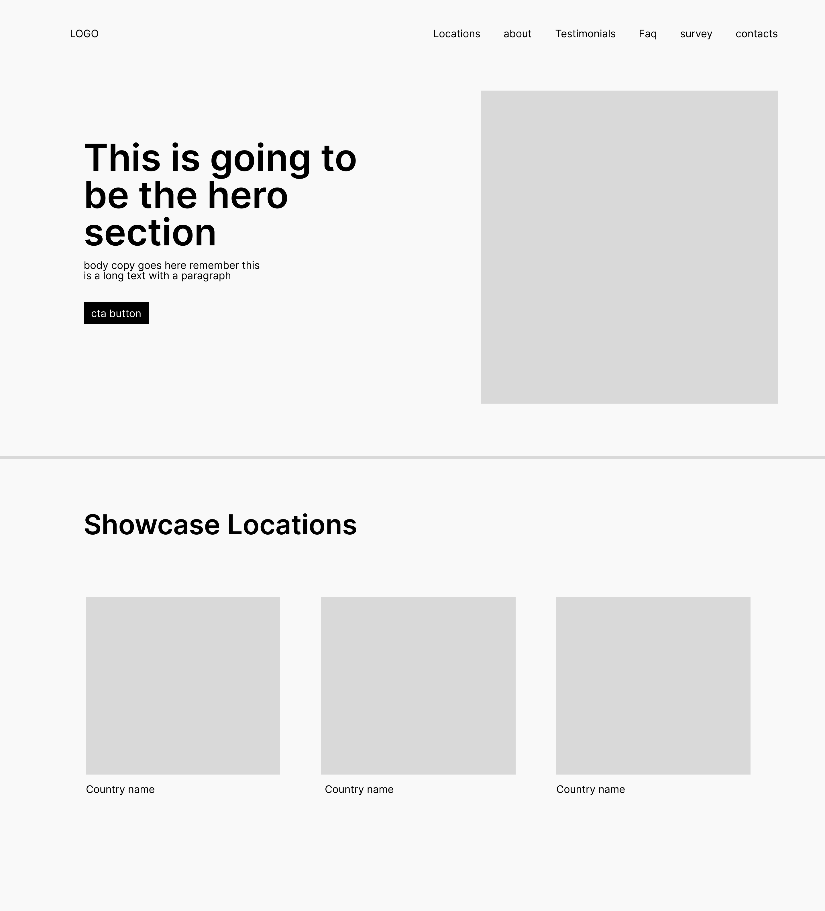
- On the second section we get some information on the team behind the product, to slowly start building trust between company and customer. This is followed by testimonials from previous customers.
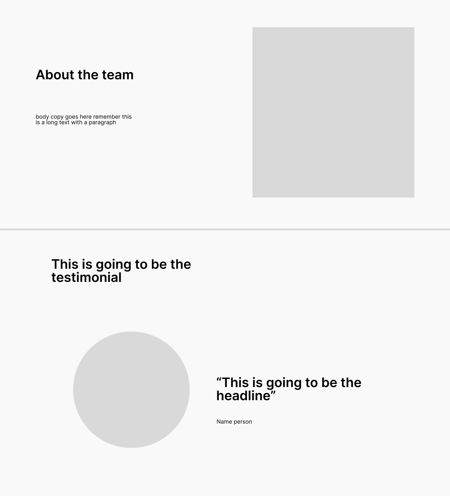
- On the third section, there's a small FAQ for users who are still in doubt on how the product works and if it's a good fit for them, and finally a CTA (Call to Action) Button for the user to fill in the survey.
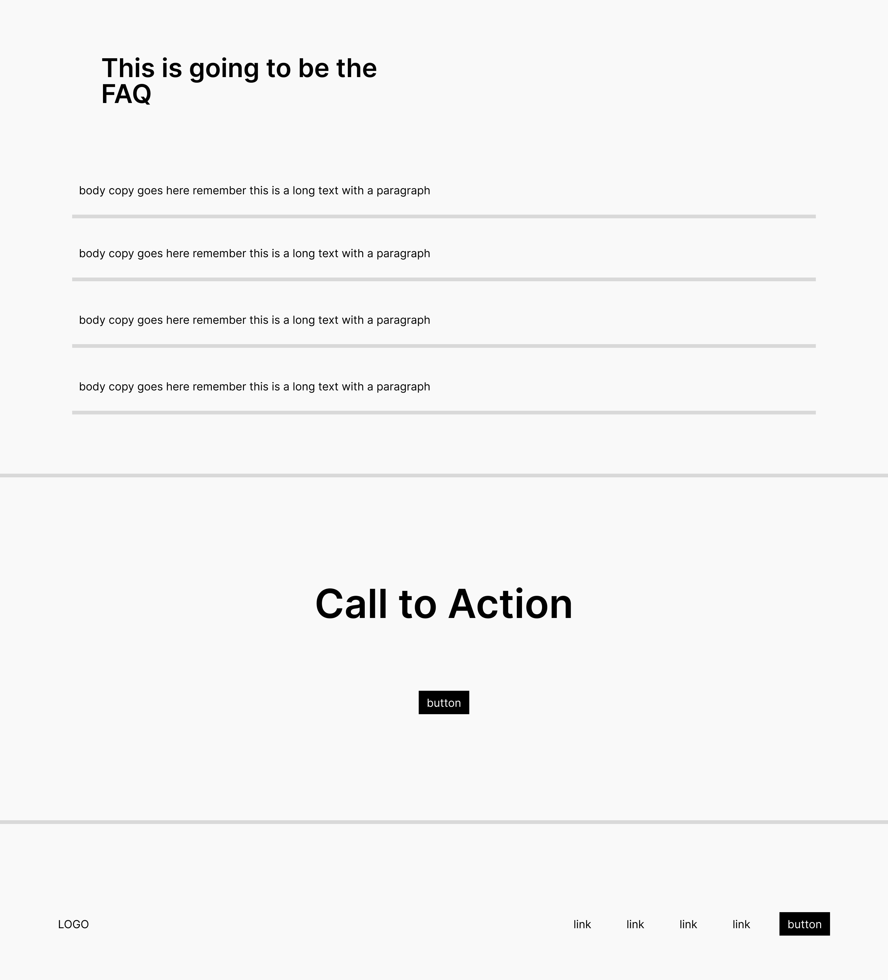
Because it is a fairly simple website, I used a scroll navigation type.
By following this sequence, the user is progressively learning about the company and product, while keeping information fairly short and relevant to their question to build their trust.
4- Creating the components
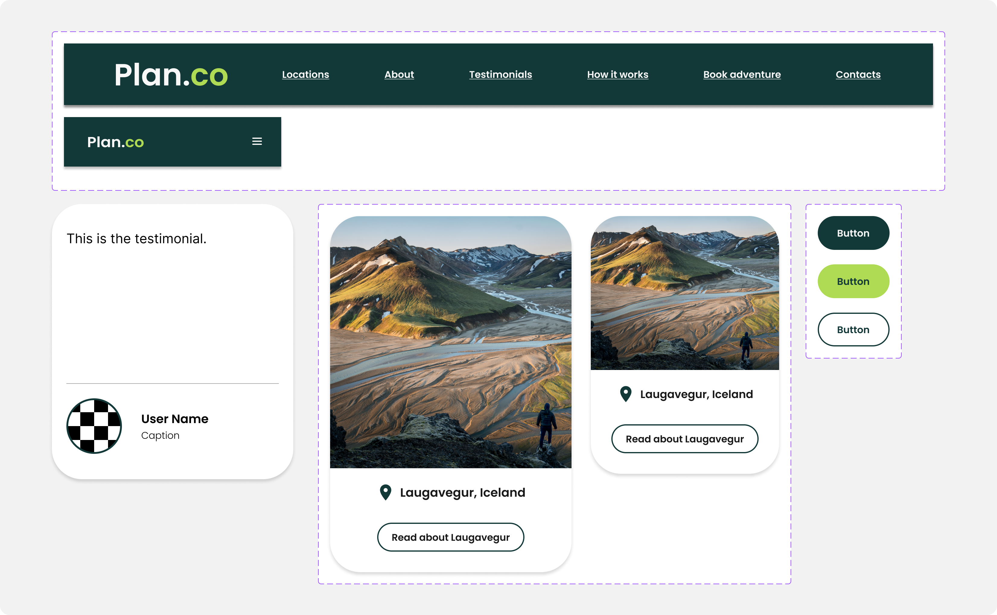
Through following this workshop, my main goal was to get more comfortable with creating Figma components with auto-layout properties. The components allow for quickly iterating between designs and automatically apply those changes across the layouts.
I designed the components for the navigation system, such as the top bar, buttons that can be easily switched by their variables, card components that are resizable and responsive, and menus that can have their order easily changed with auto-layout.
Final Design
Finally, with my components ready to go, and with my wireframe as a base, I could finally start putting the pieces together to achieve the final design. Because most of the components were created before-hand, it was much faster to build the final design. I used auto-layout on all sections, to have consistent spacing throughout the website and follow the 8pt grid, that is commonly used on UI.
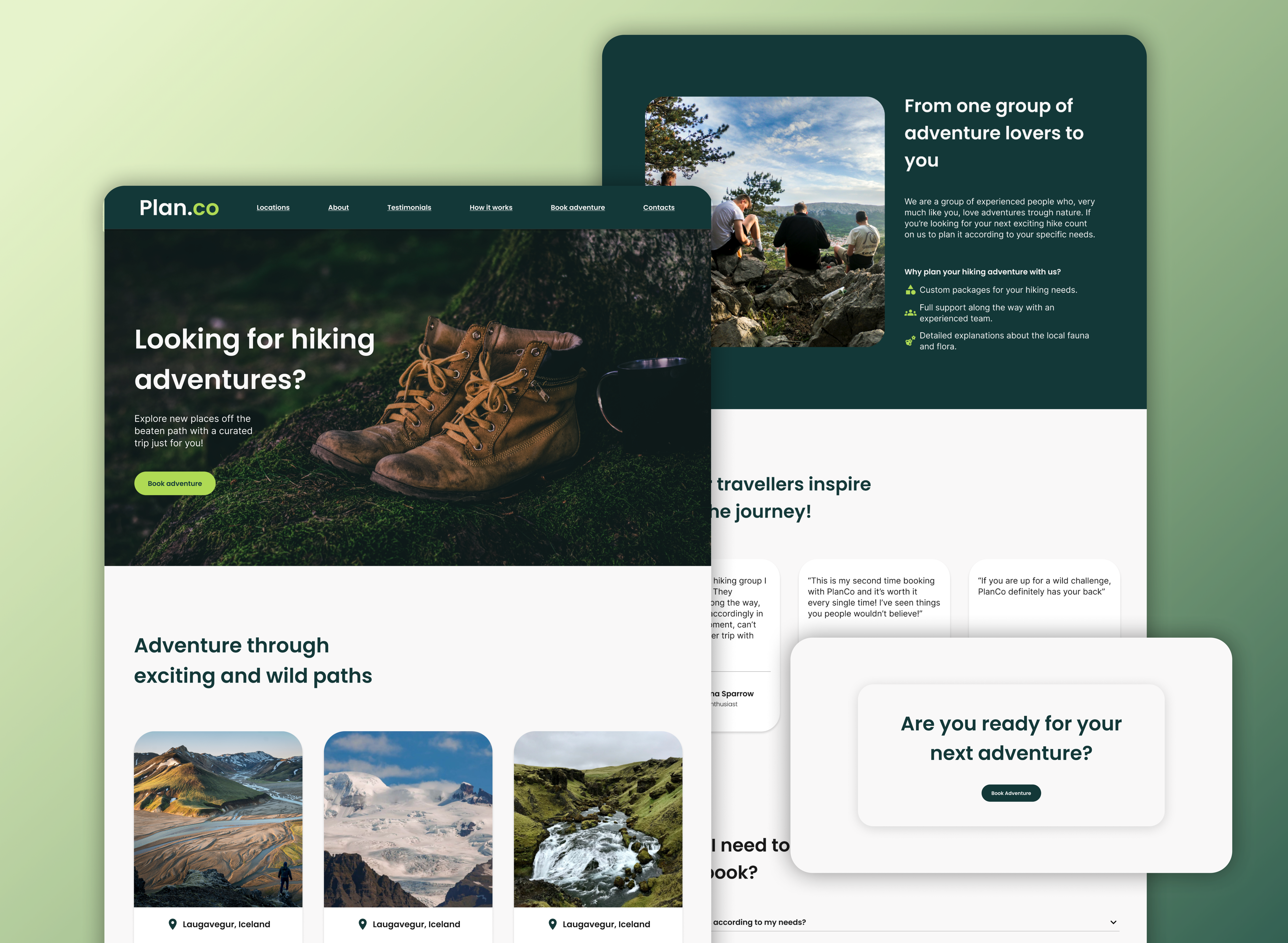
The process for building the mobile version also went smoothly, because all the components were resizing properly with the auto-layout feature, making the process that much easier.
Check the figma files for a complete view of the project:
Lessons Learned
- Spend more time in the wireframing phase, this will enable me to understand how I need to design my components and prepare them better before going into the final design.
- Design the mobile version first, and see how the details carry out into larger screens.
- Use the prototype tool before I auto layout every section of the page (this is mainly to not limit my prototype options and not undo/redo auto layouts).
